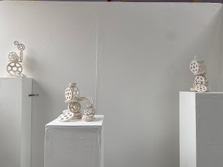
When thinking about the final layout of my exhibition space I knew immediately that I wanted three plinths paced at different lengths from the back board to place my sculptures onto. I wanted decided to keep the back boards and the plinths plain white so that the rusted sections of my sculptures will continue to stand out and I cleaned the floor around my area so that it wasn't dirty. Due to the fragility of my pieces I have put a red tape line on the floor at an appropriate distance to make sure that viewers don't get too close and cause damage to the artwork. I also screwed one of the more unstable plinths the the back board to eliminate any possibility of it wobbling or being knocked over. I believe that my space looks tidy, clean and professional.
Final exhibition layout:


Comments
Post a Comment