Posts

Showing posts from June, 2025
Image
 Castle Exhibition: Our castle work was exhibited using VR, with a few physical pieces displayed within the castle next to their respective works. I chose to experience the VR myself and while using it I found myself completely immersed within this experience. Most of the work that was displayed within the VR were pop ups of 2D images with artist statements that explain the piece. However, some of the pieces had small animations that made them move such as a wobbling jelly on the roof of the castle and kicking duck legs on the ceiling of the long gallery. I helped to invigilate this exhibition on Saturday and it attracted a decent amount of attention from the public, all of which thoroughly enjoyed the experience.
Image
 Open evening: After setting up for the show I ended up sharing my space with my course mate. I believe that our work complimented each other in terms of colour schemes and themes. Both of our piece involved aspects of nature and I believe that her stain glass centre piece goes together nicely with my set of digital collages as they both have this overlapping patchwork element to them. My course mate also displayed two sea scapes that I believe pair nicely with my rock face and cliff face images, they share similar tones as well as imagery.  Overall, I believe that the opening night of the exhibition was successful the space was open and bright which allowed everybody to move around the different works freely. And the exhibition as a whole was well put together and cohesive. 
Image
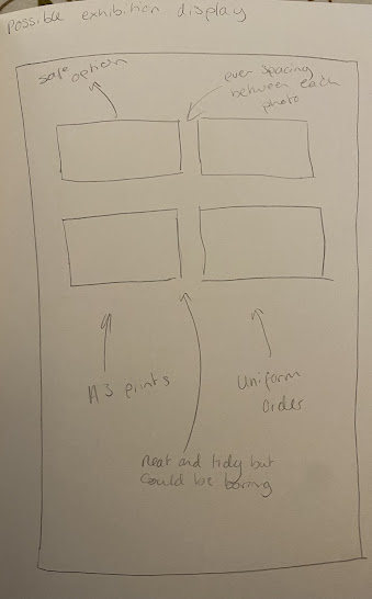
 Exhibition layout: I tried out a few different options when it came to putting up my work on the board, and initially I thought about overlaying my images to create a massive collage of them. Unfortunately, when looking at the result I found that it was messy and the images seemed to get lost in each other and it didn't have the impact that I wanted. I then thought about going in the complete opposite direction, I put my images into thin, sleek black frames and set them out in an orderly composition. I really liked the effect of this, the work seemed neat and the black frames allowed each piece to feel elevated and for it to really stand out against the white background. 
 Exhibition Label: For the end of year exhibition we were tasked with creating our own exhibitions labels with an artist statement on them to go along side our work. To do this I wrote a rough draft which I then put into Chat GTP to help make it sound more professional. I then further edited my statement to allow it to feel personal and to include important details. Exhibition Label: This series documents the artist’s journey of recovery following a decline in health. U sing photography as a form of therapy and self-expression, the artist created four digital collages that combine landscapes, food, and positive affirmations which are symbols of healing and resilience that they use in their daily life. These elements come together to form a visual narrative that reflects the emotional and physical demands of recovery, as well as the joy that can be found at the end of the journey, this piece offers a quiet but powerful testament to the strength found in the process of heal...
 FMP evaluation: This FMP lasted 16 weeks and concludes the 2nd year of my Fine Arts Foundation Degree. To begin my project I started off with some photography of walks and hikes that I did while on holiday. The theme of this project was about recovery, this was a personal theme as last year I had come down very suddenly with an illness and have spend months recovering from it. I wanted this project to explore the themes of sickness, recovery, how these thing change and affect your every day life and the resilience and perseverance needed to get better.  Through a series of images I was able to document walks, hikes and meals that I would not have been able to do or eat a month before and I found this process empowering and liberating. Once I had the foundations I was able to start developing my project. I started with cyanotypes as this is a fairly quick and easy process and used multiple of my landscape photographs to create the images. I experimented with a variety of diffe...
Image
Possible display options: - I need to think about different display options for the exhibition  - The fact that I have prints of photography means that installing my pieces will be easier and I have more flexibility when it comes to displaying my work - The most likely way that I will hang my prints is by using velcro
Image
 Final images: For the final images I had to redo my digital collages, I made a mistake on photoshop by using screenshots and using the wrong sized template which meant that the quality of the final images would have been incredibly low.  While recreating my work I made a few small adjustments such as using the text option on photoshop to write the affirmations straight onto the document instead of copy and pasting from a different app, it was also much easier to adjust the size of the text this way. I also noticed a few small spelling mistakes and corrected them as well as changing some sections that I cut out such as the sky in the third image. I thought that taking out the whole sky looked too overwhelming and so I adjusted it by only removing the corners on each side and I think that this really helped the composition of the piece to be more appealing. 
Image
 Perfecting the digital collage: Moving forward with my digital collage I decided create a word document of positive affirmations and overlay them with photographs. In contrast to the previous digital collages the images I used didn't have any human subjects in them and I used the lasso tool to cut out sections of the images.  The first photo I used was the image of my families dinner played out on the table, I cut around pieces of food and condiment bottles using a combination of the lasso tool and the magnetic lasso tool to create multiple silhouettes, I then copied over multiples of the old document and adjusted them to size. I did the same for the other two images and tried to make sure that the sections I was cutting out were following some of the natural lines present in the image so that they didn't look too random and followed some kind of pattern.  I really love the contrast between these images and my first digital collages, I think that the use of positive affi...
Image
 First attempt at digital collage: After trying out regular collage I wanted to see if I could do it digitally using photoshop. I wanted to create a piece that would represent the beginning of my journey from sickness to health and I used an image of two people walking up a hill. I then used the lasso tool on photoshop to carefully cut out the shape of the people so that I was left with just their silhouette. I then used images of old hospital reports and layered them underneath the main image to create the college. I think that this worked well, the peaceful landscape paired with the medical, clinical documents create an interesting contrast. I believe that this piece is able to convey the idea even though something looks good and fine there may be something deeper going on under the surface.  For the second image I chose to be a bit more upfront about the message and I used a photo of myself in the hospital. I again used the lasso tool but made sure to go slower and be ...
Image
 Artist research: Marcos Guinoza: The first image features a large tree as the main focal point. I think that the colours and tones that have been used are warm and inviting, the orange circle above the tree is reminiscent of a sun set and allows the piece to feel alluring. When looking at the piece I believe that the layers and shapes are clean and neat and I think that this creates a feeling of order within the work. There are five chains hanging from the lower branches of the tree, and I think that this invokes a more sinister undertone throughout the image. These chains are are ominous and I believe that they are reminiscent of a hanging noose, which I think then create a morbid aspect in the piece that is in contrast with the warm and inviting overtones. When looking at this piece it seems very surreal and the sunset and colours remind be of Dahlis 'The persistence of memory'. When looking at the piece I think that it is surreal and dream like, It feels as if the viewer ha...
Image
 Artist research: Petra Zehner: Zehners digital collage features a a woman mid jump and ledge and ladder to the side of her. When looking at this image I think that the layering of the background and objects create a real sense of depth within the piece and the beige background has a crumpled effect that allows there to be a sense of texture within the image. I believe that the depiction of the woman jumping invokes a feeling of freedom within the image, she seems liberated, like there's nothing holding her back. I think that the ladder and ledge next to her create a more grounded aspect to the work, It feels safe and reliable so that if the woman falls she will always be able to climb her way back. I believe that the beige paired with the back, white and grey tones allow the image to feel vintage and nostalgic feeling throughout the work. I believe that this piece has a completely different tone to the previous work. The brutalist architecture in the background is harsh, and ...