I believe that my most successful image was the one I took of the stairs inside the college, it was clear and crisp and the white, grey and black colours are in stark contrast with each other which provides a nice balance in colouring in the image, the finer details on the area have also been picked up which allows the image to properly convey the scenery and surroundings. I have found that when doing pin hole camera photographs I really enjoy the inverted colours which are shown again in this image, I believe that it causes the image to seem surreal and odd, like a parallel reality and it fits the eerie atmosphere that I was aiming to create with my other pin hole images as well. I think that choosing an empty stairwell for my image was a good decision as there are no blur line from people walking past or stopping in front of my camera and I believe that the emptiness adds to the eerie and hollow atmosphere. I then attempted to flip the image by placing another sheet of paper on top of the image with the shiny sides towards each other and then using an enlarger to invert the image to its original colours, however, when developing the paper I didn't leave it in the developer for long enough so it has these strange water marks and patches across the image almost as if the image is rippling.
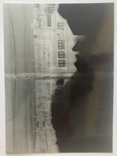
I believe that the image of the street my way home was the most successful in terms of contrast and I believe that in this image I have managed to perfect the exposure time which was thirty seconds, the sky is black and the building is white and this is the strongest contrast that I have managed to get so far. However, there is some movement that's visible in the image as I was not able to get the pin hole camera stable in the beginning, When looking at the shop signs and the lamps post in the centre of the image I can see that a lot of detail has been picked up such as the peeling paint on the lamp post, the letters on the shop signs and the brick patterns on the pavement. I think that it's an interesting image to look at and the way that the people walking by haven't been captured add to the unnerving atmosphere of the photo.
I also liked the image I took outside of the tram stop, I believe that I choose an interesting scenery with a combination of old and new buildings that provided a nice contrast with each other and was able to capture this in detail, I believe that the sparse and thin trees dotted across my image are also in congrats the urban and modern landscape which I believe invokes an atmosphere of defiance and resilience, fighting against modernisation and change, however the reason I chose this place was because I wanted to have the tram blurring by in my picture and I was unfortunately not able to capture it properly, I can see hints of a shape and some movement but not anything solid or noticeable and I believe that I did not expose the paper for long enough as my image is a mixture of grey hues rather than black and white. Apart from that I believe that this is a successful image as I have manage to capture the scenery well and I think that it fits into spooky theme that I have had for my other images.
My third image was the least successful, I was not sure how long I needed to expose the paper and so when developing the image it was very white and the majority if the image and detail had not been captured. For this image I chose to take a self portrait of me and my course mate standing in front of a church and I believe that regardless of how the image was developed what I was able to capture was still inserting. the white hues around our forms make us look like spectres that are haunting the church courtyard and the way that we are looking directly at the camera makes it seem like we are breaking the fourth wall and looking at the viewer directly, it's odd and surreal and although I didn't get the result that I wanted I was still able to learn from and make something of this image


Comments
Post a Comment