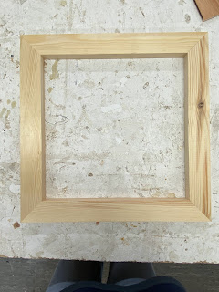
Cyanotypes and making wooden frames:
For my final piece I printed off multiple versions of the three forest photographs onto acetate and cut, cropped and stuck them together to create a large template to work with, I made sure to adjust the highlights and contrast on photoshop so that there would be a stark contrast within the finished print. I measured and cut three sheets of calico and used the older cyanotype mixture combined with a small amount of the new one on one sheet and used a freshly made mixture on the other two. When looking at the painted calico I noticed a large difference in colour between the old and new mixture, the new was a light yellow and the old was a darker green, and when looking at the results after washing them out there was a clear different between them. After washing the two that were made with the new mixture it resulted in nice blue and white contrast between the lighter and darker areas, the finer details were clear and noticeable and the different lines, shapes and forms were prominent. I believe that the use of mirroring within my image was a good decision as I have created an interesting piece that looks as if it is growing out of the middle of the canvas. The shapes and forms that have been created by mirroring remind me of a kaleidoscope, the shapes seem to almost spin and glide across the image if you stare for too long. I believe that my image is busy, chaotic and fun, there is something to look at on every section of the print and I think that this attracts the eye and keeps the attention of the viewer. I believe that my print is an explosion of shapes and tones that create a feeling of awe and wonder. When I look at this image I am inspired with mystical and fantastical imagery, like Alice in wonderland or the chronicles of Narnia. I think that my piece invokes an atmosphere of magic and mystery, the blue and white tones make it seem as if the viewer is looking into another world and the line where the images meet in the middle seem to create a ripple, as if there is a portal or pond leading to an alternate universe. I believe that including myself in the image, in a variety of different positions adds an unsettling undertone to the piece. I am camouflaged and I think that the blue and white tones allow me to hide in plain sight as opposed to the original coloured images. I think that by turning my photographs into cyanotype prints I have managed to capture and portray light in a completely new way, everything is enhanced and dramatic, a smaller leaf that might have gone unnoticed in the original stands out in the print, the contrast allows for dramatic bursts of light all over the image. Overall, I am really happy with this result and I will be using the first two prints for the Portrait Exhibition and Light night.
When looking at the third print the differences between that and the other two are obvious, the entire tone of the print is darker and the sections that are supposed to be white are a light blue, I believe that this was my weakest print out of the three and what was supposed to be an intricate and detailed image feels lack lustre and disappointing. When looking at the print I think that the finer details are too blue and seem to fade into the background, there is not enough contrast and the intricate shapes and forms seem to be swallowed by the surrounding.
I decided to make 40x40cm square frames in the 3d workshop trench my prints over and create a stretch canvas. I chose to have a square shape as the plinth we were given to display our work is a 40x40cm square, I wanted my work to take up all of the space on the plinth but not spill over the sides and I believe that a uniform shape such as a square will ground my piece.


Comments
Post a Comment