fromthegroundup and collection Lino prints:
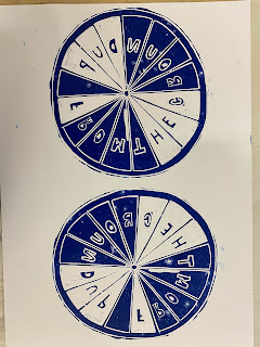
As a development from my portraits and bike photography, and as an experiment for the 'fromthegroundup' brief I decided to create Lino print bike wheels to try out different designs and experiment with different media.
One issue that I had immediately while trying to cut out my design was the Lino knife that I was using was a bit too blunt. This resulted in it being very difficult to cut out the smaller details such at the letters, especially the 'r' and 'g' letters. The stiffness on the Lino paired with the bluntness of the knife meant that quite often I would have to put a lot of force into the cut, causing the knife to slip and I would end up cutting out sections that I didn't want to. To rectify this on my next attempt I will create a larger design to that the letters aren't so small and difficult to cut out and I will make sure to use a shaper line knife.
I really like all three of my designs and I believe that they have potential. I decided to leave some of the spaces in between the spokes and not cut them out s I wanted to have a nice mixture of of empty space and print and to provide a contrast within the image, so that there is more for the viewer to look at. Otherwise, I believe that the prints would have looked too sparse and empty. by doing this I have also given myself the option to create a reduction Lino print if I choose to do so. When looking at these images I noticed that there are some marks that have still been made from sections that I have cut away. I actually quite like this, and I believe that this adds character to my print. It emphasises the fact that this is a hand made print and I think that it adds a cartoonish element to the design which invokes a friendly and playful atmosphere. I believe that the hand made elements of my print allow that viewer to resonate and connect to it as this is something that they could make themselves, it's relatable.
I think that my most successful print was the the first one using black ink, the black has print relatively smoothly with no gaps and it's strong and bold. I believe that that the values ink didn't work as well as the ink was quite patchy and left gaps across the image. In terms of composition I think that the due to the bike wheel being more of an oval shape, having horizontal and one vertical was far more effective than having both vertical. It allowed the wheels to look as if they were in motion, as I've someone was actually riding a bike. And when comparing these two prints with the more static and stagnant second images I believe that they feel more natural and active.


Comments
Post a Comment